K
N
T
T

House of Growth

Business Website / Branding / Story Telling / Web Design
Project Contents

Project Overview

Brief
My client, John is a CMO and startup founder. He created a Marketing agency to help other startups looking for a quick and cost-effective way to improve their marketing strategy. He wanted a website that stood out, showcase his expertise, and look fun but professional.
Project Goals
Establish House of Growth as a legitimate business with a professional website and consistent brand.
Problem
"Just because it's B2B doesn't mean it has to be 'boring 2 boring.'" Many marketing agencies fill their websites with buzz words and jargon that leave their clients confused and unwilling to proceed. John is also frustrated with dull marketing materials that lack personality.
Why is this happening?

01 Many startup founders do not have a marketing background

02 Marketing agencies over-rely on presenting what looks good but lack in elements that feel good

03 John is not a designer

Solution
To make sure House of Growth stands out above all other marketing agencies, the brand has to be interesting, fun, and professional. The website would not include too much marketing jargon but plenty of proof that House of Growth is reliable, trustworthy, and the authority on marketing strategy.
How to solve it?

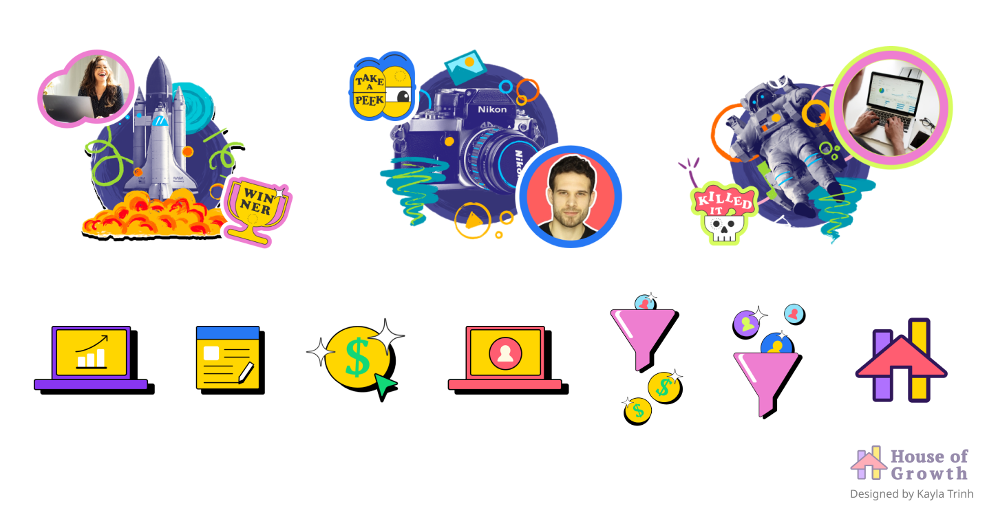
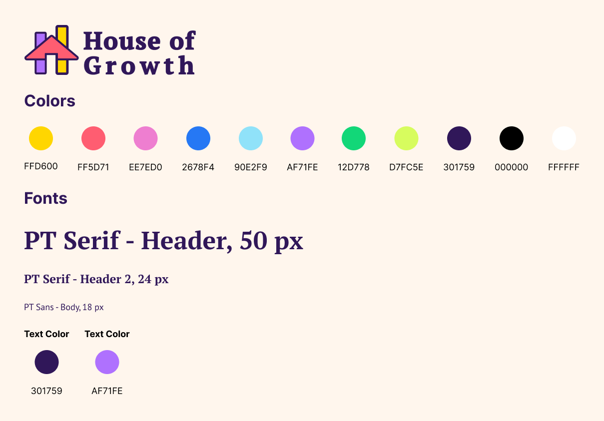
01 Curate typography, custom visuals, and graphics to be engaging, energizing, and memorable

02 Design a branding kit that John can use for his marketing deliverables

03 Provide plenty of social proof and example of work with data visuals and testimonies

‍

User Research

Methods

01 Client Interview

02 Competitive & Comparative Analyses

03 Domain Research
Reason
Due to the small scale of the project, more intensive and rigorous methods of research was not necessary. My client was very knowledgeable about his customer-base. He provided several materials to help me with competitive and comparative analyses. I did some domain research in marketing to better understand both my client and his customers so that the UX copy that I provided made sense.

User Research

Insights

01 Client interview helped me understand his target customers: early-stage startup founders

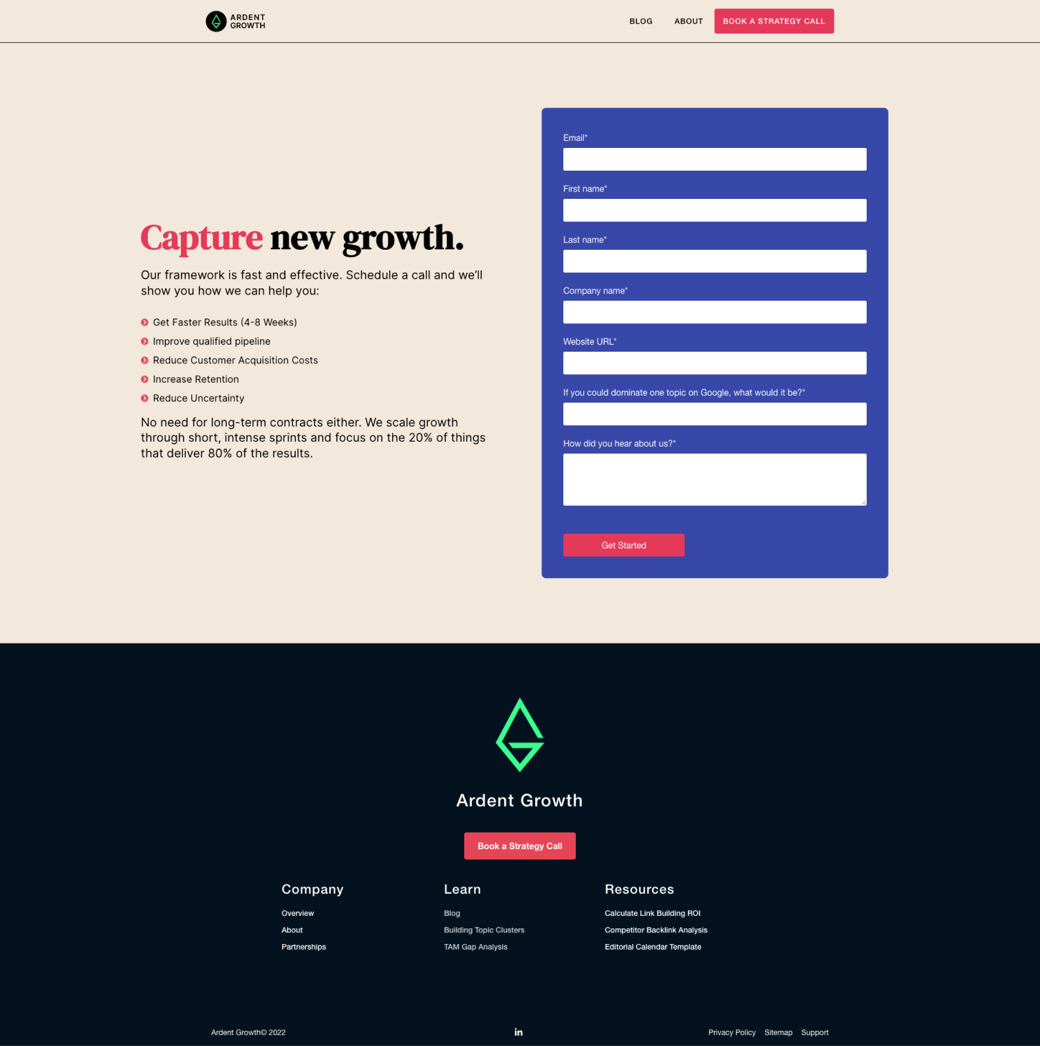
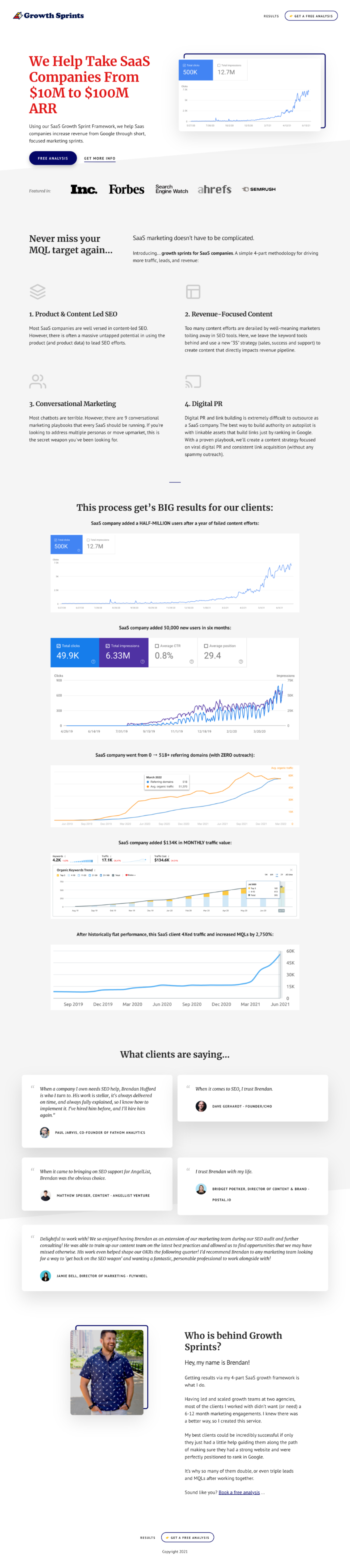
02 Competitive analysis validated client’s frustrations with marketing agencies showing lackluster designs (Growth Sprints, Ardent Growth)

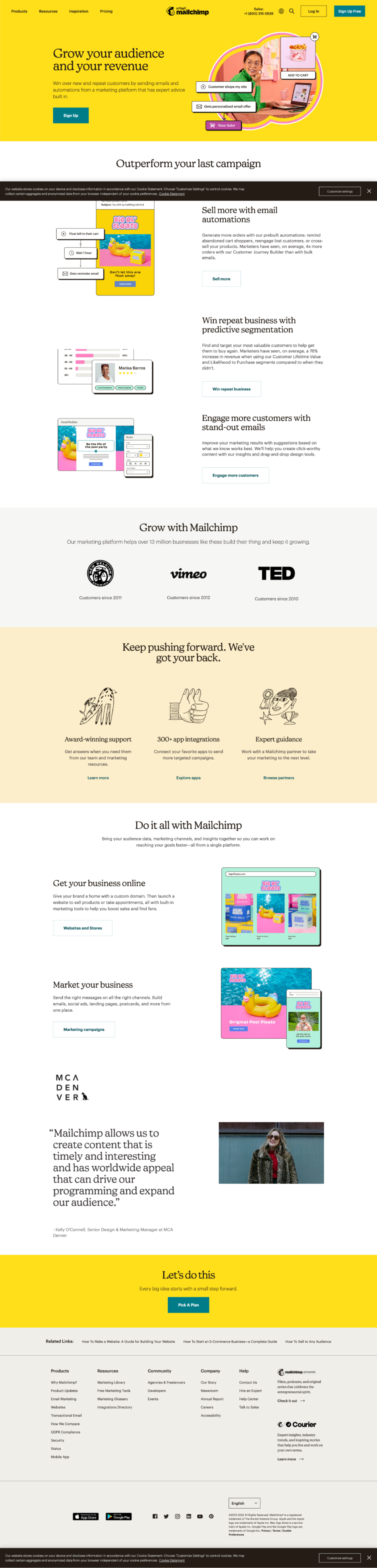
‍03 Comparative analysis MailChimp showed how a modern, bright, and fun professional website should look like

04 Domain research provided copy for best marketing practices

Persona & User Journey

How does this influence design decisions?

01 The story I wanted to tell founders started with a catchy headline and provided plenty of opportunities to connect via clear CTA

02 I used simple language and very minimal jargon to explain the business to relate with the customer needs

03 I designed the data visuals to be scannable and easy to understand

Info Architecture

Methods

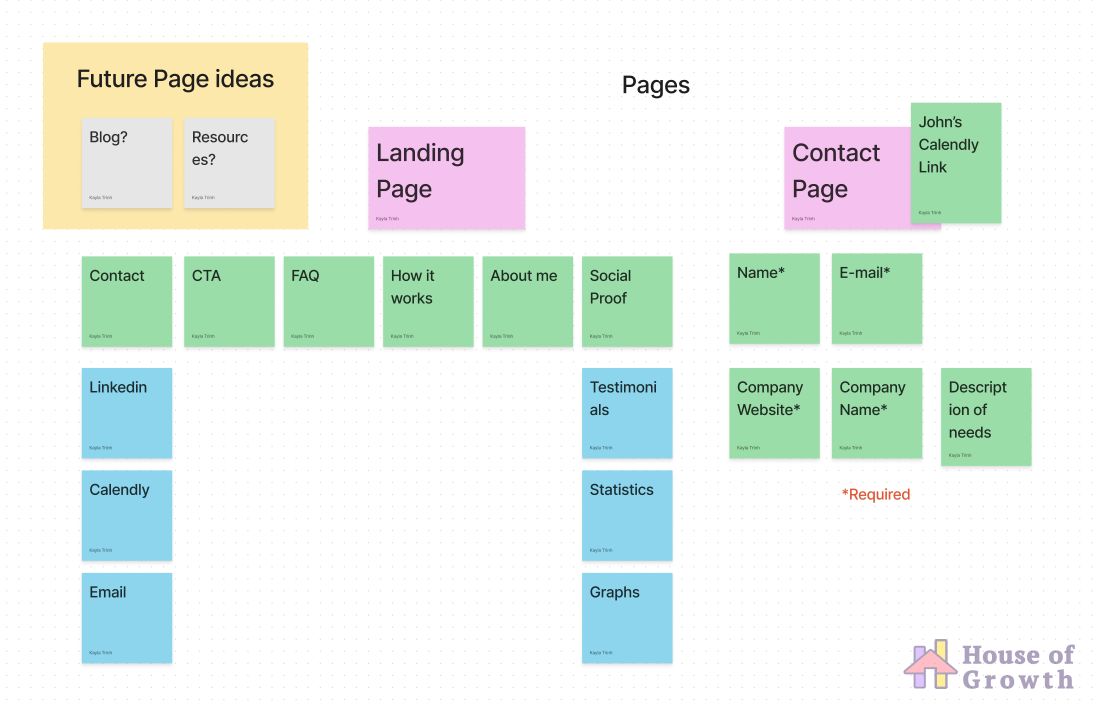
01 I wrote out a list of web pages that my client needed and within budget

02 We went with a single landing page with anchor scroll navigation, the contact page was separate per request

03 I made a list of content that my client needed to fill out
Reason
Starting from the top level of the hierarchy of the website we first considered pages, then sections, then individual content. A site map was not necessary as there was not enough content to fill out the page. I did make the navigation of footer expandable for more links in the future if he wanted to add Press, Resources, or a Blog.

Wireframe

Inspiration / Improvements

01 I created a wireframe by piecing together different parts of website elements that told the best story

02 This was easier than designing a wireframe or sketch by hands because these layout are proven to be effective by large successful companies

03 This a "Frankenstein wireframe" is mid-fidelity which focuses more on layout than content

04 Content would be added from source material provided by the client such as slide decks, business plans docs, etc, as well as domain research I did

Usability Testing

Methods

01 I had my client constantly check the website to see if everything made sense

02 I asked my UX colleagues and non-marketing friends to look over the website and describe to me what they think it is without much context

03 Overall, I asked 3 people for their opinion of the site

Reason
A rigorous usability test was not needed in this case, having a contextual inquiry of the final design was enough. After implementing, I did some testing to make sure all the links, buttons, and forms worked appropriately.

Usability Testing

Results

01 Client loved the design, he said it was exactly what he envisioned

02 My UX colleagues found some accessibility issues and inconsistencies with my design which I quickly revised

Closing Remarks
House of Growth was a fun and quick project that really pushed my creativity. When starting any website design, figuring out the key questions to ask in a stakeholder interview is essential to ensuring a smooth design process. My client is based in Dubai, so working async through slack and email was not as difficult because everything I needed was clearly communicated. As I get more website projects like this, I learn more about helping my clients find their brand, execute their vision, and translate it through UXUI thinking.
Next Steps

01 I usually maintenance websites for a small fee which includes adding new sections of information

02 For hand off, I used Webflow to give my client the freedom to make revisions and small changes, being async this is powerful!

03 By handing my client a branding kit, John can ensure that all his deliverables and materials are consistent, professional, and trustworthy